landscapes

Link to your work for constructive help, criticism or advice from the Photoclubalpha community
Forum rules
No more than three images or three external links allowed in any post or reply. Please trim quotations and do not include images in quotes unless essential.
User avatar
harveyzone
Oligarch
Posts: 162
Joined: Sun May 20, 2007 11:54 am
Location: Worcestershire, England

Re: landscapes

Unread post by harveyzone »

Javelin wrote:at work mine look very blue and yours look almost sepia toned.

As this is not disimilar to what I am seeing, perhaps your work monitors are nearer the correct than your home one.

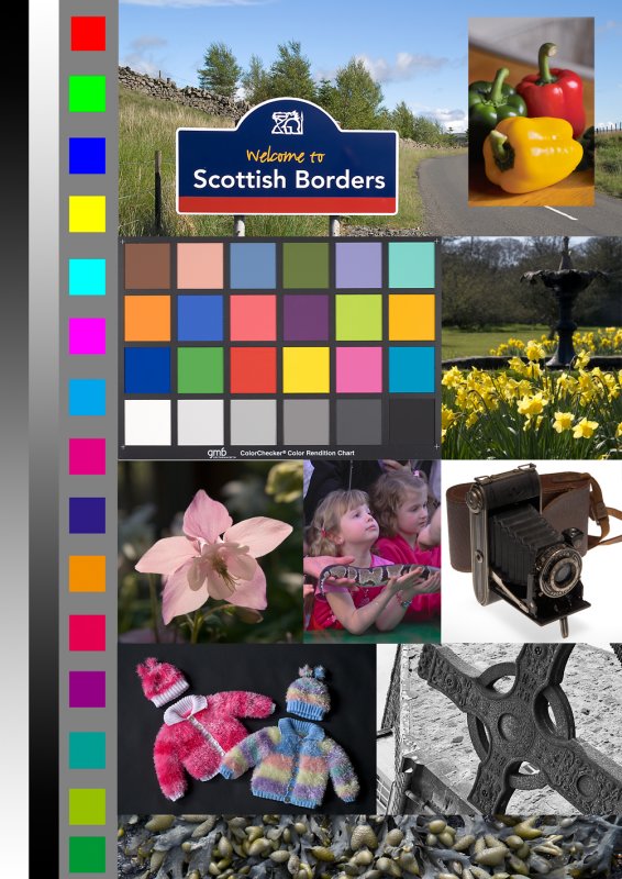
Have you looked at David's calibration image on the two machines to see which one looks most natural? They look pretty good on mine, although the girls with the snake look a little blue here, possibly as they are in shadow.
--
Tom
David Kilpatrick
Site Admin
Posts: 5985
Joined: Sat May 19, 2007 1:14 pm
Location: Kelso, Scotland
Contact:

Re: landscapes

Unread post by David Kilpatrick »

The girls with snake are Fuji S2 or S3 - typical Fuji skin tones. That's why the cameras were/are so popular. I am sure that with a current Sony, the yellow content would be much higher on that image. But that's a typical target skin colour for social photographers - not especially realistic - and that is why it is included.

David
Javelin
Emperor of a Minor Galaxy
Posts: 1856
Joined: Wed Jul 16, 2008 4:51 pm

Re: landscapes

Unread post by Javelin »

sorry I lost the text of the post I was going to make. First I found a conflicting monitor profile that was re tweaking (at least) my white point some 10-15 seconds after boot up. I fixed that and re-calibrated. and whites are much crisper.

On Davids test sheet I see the upper left red and then green squares aren't glowing like they were but the following yellow is brighter than the blue that proceeds it. the grey scales fade from deep black to white. The backlit flower on the left is a very pale pink with a little purple. in the doll sweaters (David.. why are your dolls naked?) I see pale pink yellow and the powder blue and the pink and red in the other one. the snake girls are blueish like you see Harvey. and the alien pods along the bottom are sort of a greenie yellow but muddy pale too.

I'll try another chipmunk and we can see what happens.
Javelin
Emperor of a Minor Galaxy
Posts: 1856
Joined: Wed Jul 16, 2008 4:51 pm

Re: landscapes

Unread post by Javelin »

Thanks Dusty. it's very similar to the one that came with my monitor. if what I did so far doesn't work i'll certainly give it a try.
Dusty wrote:I just found Monitor Calibration Wizard thru an article at http://www.k840.com/monitor-calibration-wizard/" onclick="window.open(this.href);return false;

I used it on my work computer and the various saved and on-line monitor tests I have show that I got marked improvement. I ran it once and got good results, then ran it again. I don't know if it was me or running it on a better calibrated profile, but it did improve again.

Maybe this will help anyone else out there.

Dusty
Javelin
Emperor of a Minor Galaxy
Posts: 1856
Joined: Wed Jul 16, 2008 4:51 pm

Re: landscapes & chipmunks

Unread post by Javelin »

ok one more... hopefully i'm getting close. I tried to copy the setting for this shot to another picture taken in less filtered light (out in the open) and was way too cool. the wb on this one is 4200 or so and the other shot didn;t look so good untill it was closer to 5k. I did order a gey card. the Douglas one that David once mentioned. The local camer shop has them too but it's just a plain piece of card for about the same money the Douglas one costs. Hopefully it doesn't take long. Maybe I should take up B&W photography :)

Image
Javelin
Emperor of a Minor Galaxy
Posts: 1856
Joined: Wed Jul 16, 2008 4:51 pm

Re: landscapes

Unread post by Javelin »

hrm I guess i'm like Yildiz. looking at it again this morning and it seems red to me. so I pulled the reds and blues down a little.

Image
aster
Tower of Babel
Posts: 6048
Joined: Mon Jul 21, 2008 2:33 pm

Re: landscapes

Unread post by aster »

Hi,

The colours seem to be getting better and better with each new processing. I have a 'warm eye' for photographic scenes but these look good, Javelin.

I spent quite some time processing this chap in the photo that I feel like he/she is a family member now. :D


Yildiz
Javelin
Emperor of a Minor Galaxy
Posts: 1856
Joined: Wed Jul 16, 2008 4:51 pm

Re: landscapes

Unread post by Javelin »

Wow I'm glad to hear it. I think I can learn to see these properly and maybe not try to be so quick about it.

Well I have the address where this guy lives. so if you want specific poses I'll ask :) theres bllack squirrels there too but they are much more shy and haven't gotten any close shots of them yet.
aster wrote:Hi,

The colours seem to be getting better and better with each new processing. I have a 'warm eye' for photographic scenes but these look good, Javelin.

I spent quite some time processing this chap in the photo that I feel like he/she is a family member now. :D


Yildiz
User avatar
bfitzgerald
Subsuming Vortex of Brilliance
Posts: 3996
Joined: Fri Sep 26, 2008 10:48 pm

Re: landscapes

Unread post by bfitzgerald »

Those fuji skin tones look too pink to me, I cannot say I would be happy with those.

This raises some interesting points, about colour balance. Too a degree it's subjective, and taste driven, though clearly well off images are spotted with ease. I have noticed a disturbing no. of images in local papers etc, with clearly off WB, in most cases too cool, even flash taken shots. And a few real duffers on colour balance, that should never have made it to print at all.

It's one area that is often overlooked in photography, and it can make a dramatic difference to some pictures.
Javelin
Emperor of a Minor Galaxy
Posts: 1856
Joined: Wed Jul 16, 2008 4:51 pm

Re: landscapes

Unread post by Javelin »

I find that if I get a bunch of shots of the same subject in diferent light or poses.. or eve 2 from the same post processed on diferent day. in the end I wind up with slightly diferent result. if I do 6 in a row I get slightly diferent results 6 times. if I ever tried to do a mosaic of a subject it would be ruined by this
User avatar
UrsaMajor
Imperial Ambassador
Posts: 650
Joined: Sat Nov 22, 2008 6:36 am
Location: Southern California

Re: landscapes

Unread post by UrsaMajor »

David Kilpatrick wrote: Here is an sRGB test file for checking printers - one which I put together to avoid the need for copyright test targets in articles. The greyscales are desaturated Photoshop data, that is, the RGB levels are precisely equal in the original aRGB version. In the sRGB conversion there are errors of a maximum 2 digits, which means 1 digit variance either way, that's inevitable with a conversion and should not be visible as a shift in hue.

Image

Download the A4 printable file:

http://www.pbase.com/davidkilpatrick/image/111353541

With these crossed grey graduations you can easily spot monitor colour consistency and calibration issues.
Are the RGB values in all of the blocks intended to match the nominal values of a Macbeth 24-color chart? When I load this image into my color-managed editor and use the readout tool, I find some significant variations in some of the blocks when compared with the Macbeth values. For example, the Blue component readout of Block 16 is 51, as compared with the 31 listed in the Macbeth data.

Assuming that the values are intended to match reasonably well, I would assume that the differences are due to a poor calibration of my monitor, except that I ran the same check with a Macbeth image that Ctein has posted on his site at http://ctein.com/postlist2.htm , and that comparison gives different values. To compound things, the different values are not consistent - in some blocks one or more of your chart's values are higher than in Ctein's chart and in some blocks they are lower.

I am just now fumbling my way through the subject of color management, so what I am about to say may represent a complete misunderstanding of the subject: I am under the impression that if I have a perfect calibration of my monitor/graphics card combination and a perfectly color-balanced image of a Macbeth chart, when I display that image in my color-managed editor and use the editor's readout tool, the values it shows for a given block will match the values that are specified for the Macbeth chart in that block. Is this correct? (I know that there is no such thing as a perfect calibration and/or a perfect copy of the Macbeth chart - I'm just talking about the theory.)

Thanks in advance for the assistance.

With best wishes,
- Tom -
David Kilpatrick
Site Admin
Posts: 5985
Joined: Sat May 19, 2007 1:14 pm
Location: Kelso, Scotland
Contact:

Re: landscapes

Unread post by David Kilpatrick »

No, the RGB blocks are primaries - full yellow, full magenta, etc - straight mixes.

Depending on your management of the sRGB source, they will open with slightly adjusted values not 50/100 etc.

Some of the primaries are not reproducible properly on screen on by a printer, which is why they are included. They give you an idea, when printed, of the type of visible screen colours which look radically different on paper. If you convert the image to CMYK you will see these primaries change a great deal, while the Macbeth colours should remain constant.

The chart was originally created for my own uses and to avoid reproducing copyright test files in magazines, so no explanation of the different images (for example, the celtic cross image is derived from a greyscale image pasted into the RGB document) is given.

David
User avatar
UrsaMajor
Imperial Ambassador
Posts: 650
Joined: Sat Nov 22, 2008 6:36 am
Location: Southern California

Re: landscapes

Unread post by UrsaMajor »

David Kilpatrick wrote: No, the RGB blocks are primaries - full yellow, full magenta, etc - straight mixes.

Depending on your management of the sRGB source, they will open with slightly adjusted values not 50/100 etc.
I assume that you are referring to the color blocks in a vertical column at the left of the image. In sRGB mode, the readouts of the top six of those blocks on my system are almost perfect - the greatest variation from theory of any component is only 0.4 %, and most are spot on. As I go further down the column the variation from what I think I should get becomes larger, but that may be a misunderstanding on my part of what to expect. (What values should I expect to see for the last ten blocks in that column on a properly calibrated monitor?)

What I was referring to in my message above was the readouts that I get from the colors in the Macbeth chart in your image, and I was wondering if a difference between the readouts of those blocks from the values published by X-Rite indicates an error in the calibration of my monitor. For example, in Block 16 - which is called "yellow" in the published table - the quoted values are R = 231, G = 199, B = 31. The values I measure on my screen from your image are R = 255, G = 224, B = 51.

Checking all of the color blocks in the Macbeth portion of your image against the published values, I get the following results:

Average variation: Red = 7.8 % Green = 16.1 % Blue = 14.2 %
Standard deviation: Red = 35.2 % Green = 8.4 % Blue = 19.5 %

I realize that I may misunderstand how your image should be interpreted, and the values in the Macbeth portion of your image may have nothing to do with a calibration error of my monitor. However, at the moment I am assuming that they do, and am fumbling around attempting to figure out what to do to insure that my monitor calibration is not going to introduce any errors on top of the ones that I make myself - which are plentiful enough that I need no additional issues.

With best wishes,
- Tom -
David Kilpatrick
Site Admin
Posts: 5985
Joined: Sat May 19, 2007 1:14 pm
Location: Kelso, Scotland
Contact:

Re: landscapes

Unread post by David Kilpatrick »

That's not a digital MacBeth target - it is an actual photo of the target. I think it represents the colours produced by the D7D. Please don't use this test image to measure colours, its purpose is - and always was - to match prints. The chart is reproduced from the original in magazines, and then a print reproduced after calibrated scanning, to show the difference (though I rarely show both, it is misleading as whatever calibration is used, the scan is never accurate).

My main use of this chart is to compare printed output with reference prints (know good examples - like Epson papers in the Epson 3800 using Epson profiles), and with the screen. I do not use it to make any kind of measurement, that required a totally different sort of image file.

David
User avatar
UrsaMajor
Imperial Ambassador
Posts: 650
Joined: Sat Nov 22, 2008 6:36 am
Location: Southern California

Re: landscapes

Unread post by UrsaMajor »

David Kilpatrick wrote: That's not a digital MacBeth target - it is an actual photo of the target. I think it represents the colours produced by the D7D. Please don't use this test image to measure colours, its purpose is - and always was - to match prints. The chart is reproduced from the original in magazines, and then a print reproduced after calibrated scanning, to show the difference (though I rarely show both, it is misleading as whatever calibration is used, the scan is never accurate).

My main use of this chart is to compare printed output with reference prints (know good examples - like Epson papers in the Epson 3800 using Epson profiles), and with the screen. I do not use it to make any kind of measurement, that required a totally different sort of image file.
Thanks! You have removed a big load from my mind, as I was assuming that it was intended to represent Macbeth colors, and this was leading me to a lot of concern over the calibration of my monitor.

With best wishes,
- Tom -
Post Reply

Who is online

Users browsing this forum: No registered users and 12 guests