Hi all,
Happy New Year!! I hope this year will bring lots of happiness and joy into our lives! And besides, a lot of new beautiful shots!
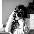
I took this photo today. I used clone tool + heal brush to make the skin look perfect and filled with color. Here is the version with original color and edited color.
Anne.
Portrait, 2012
Forum rules
No more than three images or three external links allowed in any post or reply. Please trim quotations and do not include images in quotes unless essential.
No more than three images or three external links allowed in any post or reply. Please trim quotations and do not include images in quotes unless essential.
-
Anne_LilyofTheValley
- Oligarch
- Posts: 182
- Joined: Fri Feb 11, 2011 7:29 am
Portrait, 2012
- Attachments
-
- DSC08089.jpg (207.39 KiB) Viewed 5544 times
-
Dr. Harout

- Subsuming Vortex of Brilliance
- Posts: 5662
- Joined: Wed May 30, 2007 7:38 pm
- Location: Yerevan, Armenia
- Contact:
Re: Portrait, 2012
I hope the one on the left is the edited one... 
If no (don't kill me) then I like the first one
If no (don't kill me) then I like the first one

Re: Portrait, 2012
Hi Anne - I like the one on the left as well  . I look forward to seeing more of your portraits over the year - always a pleasure.
Nex 5, Nex 6 (IR), A7M2, A99 and a bunch of lenses.
-
Anne_LilyofTheValley
- Oligarch
- Posts: 182
- Joined: Fri Feb 11, 2011 7:29 am
Re: Portrait, 2012
Thank you very much.
The left one is the original And the right one - edited.
I like them both. I think that the edited one looks fashionable
The left one is the original
I like them both. I think that the edited one looks fashionable
Re: Portrait, 2012
I'm thinking of the edited picture that it is more attractive, but I like the first one too.
Great work...
Great work...
-
mikehawthorne
- Grand Caliph
- Posts: 421
- Joined: Thu Aug 07, 2008 5:41 am
Re: Portrait, 2012
i like both and a nice looking girl to boot!
-
Anne_LilyofTheValley
- Oligarch
- Posts: 182
- Joined: Fri Feb 11, 2011 7:29 am
-
jcoffin
- Grand Caliph
- Posts: 319
- Joined: Tue Nov 11, 2008 4:47 am
- Location: Colorado Springs, Colorado, USA
Re: Portrait, 2012
Hmm...if you'll forgive my playing with it a bit, perhaps an edit somewhere between the two would work:
- Anne Edited.jpg (47.25 KiB) Viewed 5492 times
-
InTheSky

- Viceroy
- Posts: 872
- Joined: Wed Oct 08, 2008 4:23 am
- Location: Montreal, Quebec, Canada
- Contact:
Re: Portrait, 2012
The edited one has too much purple to my taste ..., It looks like if the camera create noise over all the image.
Probably keeping the Glove black and keeping the air on purple will be good and try also to remove a little bit more purple on the shade of the face and on the lips of the subject (probably another choice of lips color will make a punch ...)
This is just feeling if you need some comment , but they are both good picture.
Regards,
Frank
Frank
A7 (R, S & R II) + NEX 3N ( and few lenses )
A7 (R, S & R II) + NEX 3N ( and few lenses )
-
Greg Beetham
- Tower of Babel
- Posts: 6117
- Joined: Sun May 27, 2007 3:25 pm
- Location: Townsville, Qld. Australia
- Contact:
Re: Portrait, 2012
I think I like the original one just fine, I can't see anything wrong with that photo even with my reading glasses on.
Greg
Greg
Re: Portrait, 2012
Someties I find it very difficult and dangerous to comment on Anna's portraits... : ) Since there's that derivation of artist's own desires to interpret a certain situation agains the most natural look, it's hard to get to the bottom of it.
All that said, I like the ones with the least bluish-tinted processing. It's probably due to the model's natural colour of complexion which shows more vitality against the cold of the blue-tinted one.
Thanks for sharing, Anne. : )
Yildiz
.
All that said, I like the ones with the least bluish-tinted processing. It's probably due to the model's natural colour of complexion which shows more vitality against the cold of the blue-tinted one.
Thanks for sharing, Anne. : )
Yildiz
.
Last edited by aster on Sun Jan 08, 2012 5:42 pm, edited 2 times in total.
-
pakodominguez

- Minister with Portfolio
- Posts: 2306
- Joined: Tue May 22, 2007 5:38 pm
- Location: NYC
- Contact:
Re: Portrait, 2012
The problem when you show original and final proof, is that people don't understand the final as "FINAL", I mean, the "bluish" tone is not a mistake, but a style. Then, you can like the style or not... As you can see, the second shot, even if more neutral, keep the cold tone.
Pako
------------
http://www.pakodominguez.photo/blog" onclick="window.open(this.href);return false;
------------
http://www.pakodominguez.photo/blog" onclick="window.open(this.href);return false;
-
David Kilpatrick
- Site Admin
- Posts: 5985
- Joined: Sat May 19, 2007 1:14 pm
- Location: Kelso, Scotland
- Contact:
Re: Portrait, 2012
Anne, if I can give some help at a higher level - to do with perspective and posing - it's in this that the pictures have most weakness, and in the lighting and colour they have the most strength.
The hands in any portrait are a problem. Physically, the area of a hand can be almost as large as the face, and usually larger than the features of a face. When a hand is placed closer to the camera than the face, even a small enlargement caused by a close viewpoint can give it a weight in the picture which tends to match or dominate the face.
When placing a hand below the chin, as in your second shot, the visual weight of the hand can be reduced and it can look slimmer and more elegant if you ask the sitter to turn the hand, curling it round the side of the face. With the hand turned a little sideways, it can occupy maybe half the area; your shot has the back of hand too dominant, and not tapering at the bottom of the frame. By turning the wrist (and also making an adjustment to the 'unused' fingers to curl them attractively) this can be greatly improved, returning attention to the face.
In general, where hands are brought forward near the face/neck/chin (but not in something exaggerated like my avatar picture!) it's best to use a longer focal length, moving back. It also helps to use a higher viewpoint, either asking the subject to sit down when you are standing, or looking for a slightly elevated camera angle.
Finally, if you have really good lighting control, the light should be feathered off any exposed flesh (hand, arms, shoulder) which is closer to the camera than the face. Shoulders are a constant problem in wedding photography, where the bride will look slimmer if angled a little side-on to the camera - but this tends to bring one shoulder towards the lens. A scarf, shawl, drape or the veil can be used to cover half the shoulder which reduces its weight. But I see many wedding photographs where one shoulder occupies more image area than the entire face of the bride and it also more brightly lit. In the past we used vignette filters (Cromatek, Sailwind, etc) to help - today we can use digital vignetting and very careful burning in.
Hope this is useful (with my MPA hat on not my Photoclubalpha hat on).
David

-
Anne_LilyofTheValley
- Oligarch
- Posts: 182
- Joined: Fri Feb 11, 2011 7:29 am
Re: Portrait, 2012
Thank you Frank, Pako, Yildiz, Greg, Jcoffin for your comments. I am still experimenting. Don't have much time to spend more time on details, that's why I still make lots of mistakes.
Thank you very much David for your comment, it is helpful as always.
I agree that in my case I didn't pay attention to hands, maybe because I was hurrying and wanted to do some quick portraits of my friend.
Thank you very much David for your comment, it is helpful as always.
I agree that in my case I didn't pay attention to hands, maybe because I was hurrying and wanted to do some quick portraits of my friend.
Who is online
Users browsing this forum: No registered users and 32 guests