landscapes

Link to your work for constructive help, criticism or advice from the Photoclubalpha community
Forum rules
No more than three images or three external links allowed in any post or reply. Please trim quotations and do not include images in quotes unless essential.
User avatar
harveyzone
Oligarch
Posts: 162
Joined: Sun May 20, 2007 11:54 am
Location: Worcestershire, England

Re: landscapes

Unread post by harveyzone »

Javelin wrote:here is a similar scene. I think it's the saturation slider thats adding the cast in ACR
Sorry - similar cast on this one too. Here is my tweak on this...

Image

I would be suprised if it is a problem at my end. My monitors are calibrated (roughly - by eye), and I have viewed it on my main PC and 2 (uncalibrated) laptops, all with the similar results. I am also only seeing the cast on your images, and not on others posted. The cast is similar on all your images, and I effectively add green (actually take out a little blue and/or red in varying amounts) to get something that looks better to my eye.

Thanks David, that is reasuring about my monitor calibrations.
--
Tom
User avatar
harveyzone
Oligarch
Posts: 162
Joined: Sun May 20, 2007 11:54 am
Location: Worcestershire, England

Re: landscapes

Unread post by harveyzone »

Dr. Harout wrote:Tom, it's a bit greenish on mine. Not only the last shot.
Thanks. They may be verging on going green - I have effectively been adding green (by taking out blue and red - the amount of each varying for each shot). They are only rough corrections, and I may have pushed them a little too far to make it obvious, but they are nearer to how I would like to see them on my monitor than the originals.

It is worth having input from many sources, as I am aware that my monitors may be out too, although I beleive them too be roughly correct.
--
Tom
aster
Tower of Babel
Posts: 6048
Joined: Mon Jul 21, 2008 2:33 pm

Re: landscapes

Unread post by aster »

Hi Tom,

For what it's worth, I see the pinkish cast in the first and the greenish cast in the second also though the greenish version looks less nnatural than the pikish one.

Yildiz
User avatar
harveyzone
Oligarch
Posts: 162
Joined: Sun May 20, 2007 11:54 am
Location: Worcestershire, England

Re: landscapes

Unread post by harveyzone »

aster wrote:For what it's worth, I see the pinkish cast in the first and the greenish cast in the second also though the greenish version looks less nnatural than the pikish one.
Thanks - are you refering to the landscape, the dog or the chipmunk (or all three)?
--
Tom
aster
Tower of Babel
Posts: 6048
Joined: Mon Jul 21, 2008 2:33 pm

Re: landscapes

Unread post by aster »

All of them actually but the dog and the chipmunk photos are less tolerating than the landscape photo because we all are rather used to seeing landscape taking a shade of the present sky conditions pertaining to a certain time of the day like before sunset or after dawn. That's why I'll dismiss the landscape but say that animals+environment shots do need correcting.

Yildiz
User avatar
harveyzone
Oligarch
Posts: 162
Joined: Sun May 20, 2007 11:54 am
Location: Worcestershire, England

Re: landscapes

Unread post by harveyzone »

aster wrote:All of them actually but the dog and the chipmunk photos are less tolerating than the landscape photo because we all are rather used to seeing landscape taking a shade of the present sky conditions pertaining to a certain time of the day like before sunset or after dawn. That's why I'll dismiss the landscape but say that animals+environment shots do need correcting.
I am now begining to doubt my monitor colours as that is three now saying mine are green. :( It is strange as I view a lot of photos and do not generally see a colour cast on others.

I have re-visited all three images. I would discount the landscape as it is quite hard to know what colours it should be (I keep sending it green or yellow!) and I am struggling to get a result I am happy with, but the other two look pretty good here. I noticed that two of the originals (dog and chipmunk) were saved in AdobeRGB colour space which is unwise for web as you cannot be sure that other users browsers are colour correcting. Mine were AdobeRGB too, but are now corrected to sRGB (no other changes). It made no real difference on my monitor/browser.
--
Tom
aster
Tower of Babel
Posts: 6048
Joined: Mon Jul 21, 2008 2:33 pm

Re: landscapes

Unread post by aster »

Hi Harveyzone,

I had a go at the dog photo but only for a limited time. Here's what I got. I think the dog's fur looks more natural now while the ground retains a colour that's more suitable for the little rocks/stones. I'm a little worried that it may appear a little blue though.

Your thoughts please? So I can judge if we are seeing the tints of colour differently due to our monitor settings.

Yildiz
Attachments
Does the photo look bluish?
Javelin
Emperor of a Minor Galaxy
Posts: 1856
Joined: Wed Jul 16, 2008 4:51 pm

Re: landscapes

Unread post by Javelin »

here is a diferent take. the first one was adjusted manually. the second was using his white stripe as a white point to set the colour. I think that one is a little too blue and makes it look a little less saturated. Here is a link to the craw file. maybe someone can point out something i'm doing wrong when I take the picture in the first place?

http://www.uranium-238.com/~stf/Glenn/DSC02565.ARW

Image

Image
harvey
Oligarch
Posts: 201
Joined: Wed Jun 25, 2008 2:25 pm
Location: Scotland

Re: landscapes

Unread post by harvey »

Javelin wrote:well I can certainly see it now. the first dog is certainly pink I guess I was looking in the highlights. I think I just don't have an eye for these subtle colours because I certainly didn't see it untill it was pointed out so clearly. I have some more shots to process from RAW..maybe I should give on on the raw processing and just let the camera decide the colours in jpg, Don pointed out that I was having trouble geting the colour right too. thanks for your help here.
If you go jpeg you will be in a worse position to fix any WB issues.
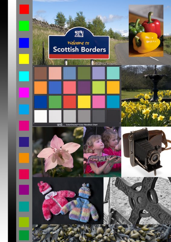
There are two parts to this, take the picture with the correct WB and then can you trust the colours from your monitor.

Why don't you get hold of a gray card and take some paired shots with and without the card.
Do whatever you normally do for WB correction but then correct the WB using the dropper on the card with
whatever software you are using and compare them.

I think expodisc is also an option but I don't have any experience of it, maybe the just give you
WB at the camera position.

Now for the monitor bit...

You can download various "calibration" images from digital processors (Peak Imaging for example) that you
could use to see if you think your monitor is causing you problems.

The expensive way is to get a calorimiter, I have a Spyder which revealed that my monitor was pretty good
to start with.

Harvey
aster
Tower of Babel
Posts: 6048
Joined: Mon Jul 21, 2008 2:33 pm

Re: landscapes

Unread post by aster »

Hi,

Here is my post-processing of the Chipmunk cRaw file. I like warm colours but I went along with what the craw file provided; -0.57 underexposed; 5800K whitebalance; DRO: Highlight=70, Shadow=80; Contrast: 20. Processed in IDC of Sony.

Yildiz

The cropped version:

Image

Original, uncropped version:

Image
Javelin
Emperor of a Minor Galaxy
Posts: 1856
Joined: Wed Jul 16, 2008 4:51 pm

Re: landscapes

Unread post by Javelin »

I am ordering a greycard now. I think WB is definatly where my problems start. the other problem is I don't seem to have an eye to pick out where the overall colour cast is wrong. the diferences seem subtle to me. my work monitors make a mess of everything but I think my home one is pretty good. it came with a software calibration utility that seems to work well. Like I say when it's pointed out to me I can see the diference clearly. I can get the spider 3 calibration device locally for what seems like a decent price. it's good because it takes into account the ambient light in the room. does this write it's own profile for the monitor or do you have to manually adjust the monitor controls to dial it in?

Yildiz: I can't really comment on your treatment. at work mine look very blue and yours look almost sepia toned.
David Kilpatrick
Site Admin
Posts: 5985
Joined: Sat May 19, 2007 1:14 pm
Location: Kelso, Scotland
Contact:

Re: landscapes

Unread post by David Kilpatrick »

Here is an sRGB test file for checking printers - one which I put together to avoid the need for copyright test targets in articles. The greyscales are desaturated Photoshop data, that is, the RGB levels are precisely equal in the original aRGB version. In the sRGB conversion there are errors of a maximum 2 digits, which means 1 digit variance either way, that's inevitable with a conversion and should not be visible as a shift in hue.

Image

Download the A4 printable file:

http://www.pbase.com/davidkilpatrick/image/111353541

With these crossed grey graduations you can easily spot monitor colour consistency and calibration issues.

David
harvey
Oligarch
Posts: 201
Joined: Wed Jun 25, 2008 2:25 pm
Location: Scotland

Re: landscapes

Unread post by harvey »

Javelin wrote: I can get the spider 3 calibration device locally for what seems like a decent price. it's good because it takes into account the ambient light in the room. does this write it's own profile for the monitor or do you have to manually adjust the monitor controls to dial it in?
You go through a calibration process:
  • First set brightness and contrast so there is detail in blacks and whites
  • Then the colorimeter reads sequences of red,green,blue and grey values
The software creates a profile that is installed for that monitor. You can see before and after images and they
were pretty close for me. I dialed back the brightness a bit from what the process would have given me.

I suppose the other thing you could do is compare your images with similar ones from photo agencies, I know
that when I did this it was really obvious how many of my Kodachromes had green-tinged sky.
Without neutral grey in an image it is hard to know in isolation what the proper WB would be and in the end you
might as well go with that you prefer.

Harvey
User avatar
harveyzone
Oligarch
Posts: 162
Joined: Sun May 20, 2007 11:54 am
Location: Worcestershire, England

Re: landscapes

Unread post by harveyzone »

aster wrote:Your thoughts please? So I can judge if we are seeing the tints of colour differently due to our monitor settings.
As you suggest - the dog one looks too blue to me.
Your chipmonk ones on the other hand look too red/warm, and also rather heavy/dark.
Last edited by harveyzone on Wed Apr 15, 2009 9:41 pm, edited 1 time in total.
--
Tom
User avatar
Dusty
Emperor of a Minor Galaxy
Posts: 2215
Joined: Thu Dec 18, 2008 5:04 pm
Location: Ironton, Missouri, USA

Re: landscapes

Unread post by Dusty »

I just found Monitor Calibration Wizard thru an article at http://www.k840.com/monitor-calibration-wizard/" onclick="window.open(this.href);return false;

I used it on my work computer and the various saved and on-line monitor tests I have show that I got marked improvement. I ran it once and got good results, then ran it again. I don't know if it was me or running it on a better calibrated profile, but it did improve again.

Maybe this will help anyone else out there.

Dusty
Post Reply

Who is online

Users browsing this forum: No registered users and 7 guests